Hi, I'm Edyta, Product Designer

I build products end-to-end
with AI and eyes on real people.

B2B
B2C
SaaS
8+ years exp
AI-oriented
Product Strategy, User Research, Design Systems, Prototyping, Discovery & Delivery, B2B SaaS, End-to-End, Visual Craft, UI, UX, AI

Selected case study

Localo · Report Builder

Localo · Report Builder

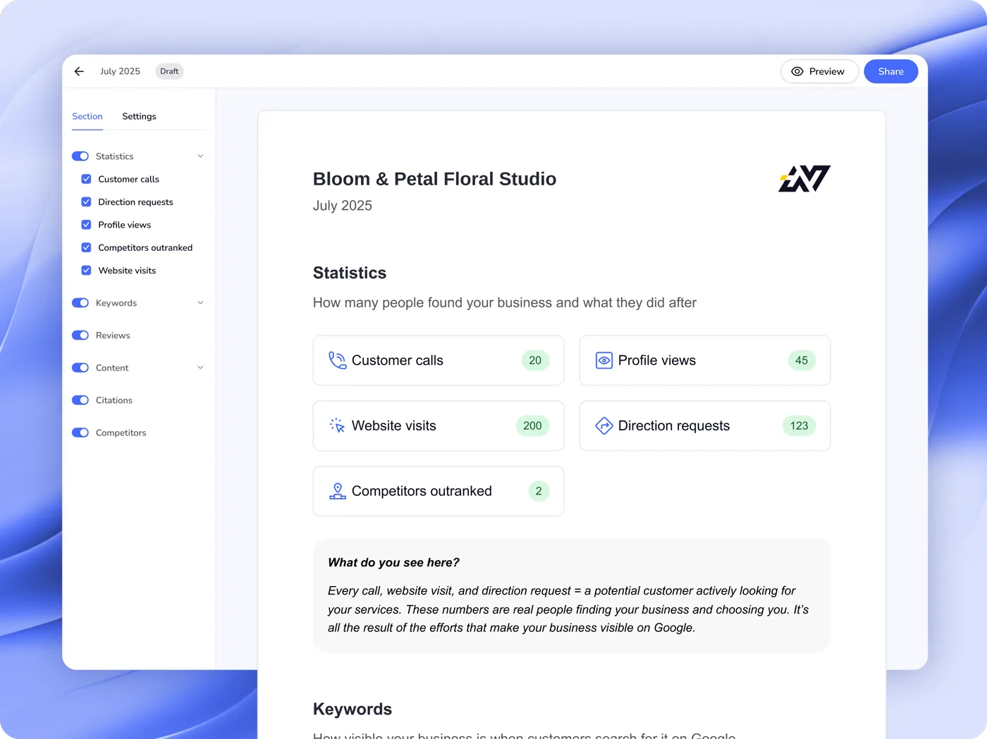
Agencies used to piece client reports together from screenshots, several hours a month. Today 60% of report users generate and send them automatically.
Product Design
B2B2C
SaaS
UX Strategy
Codete · Four B2B products

Codete · Four B2B products

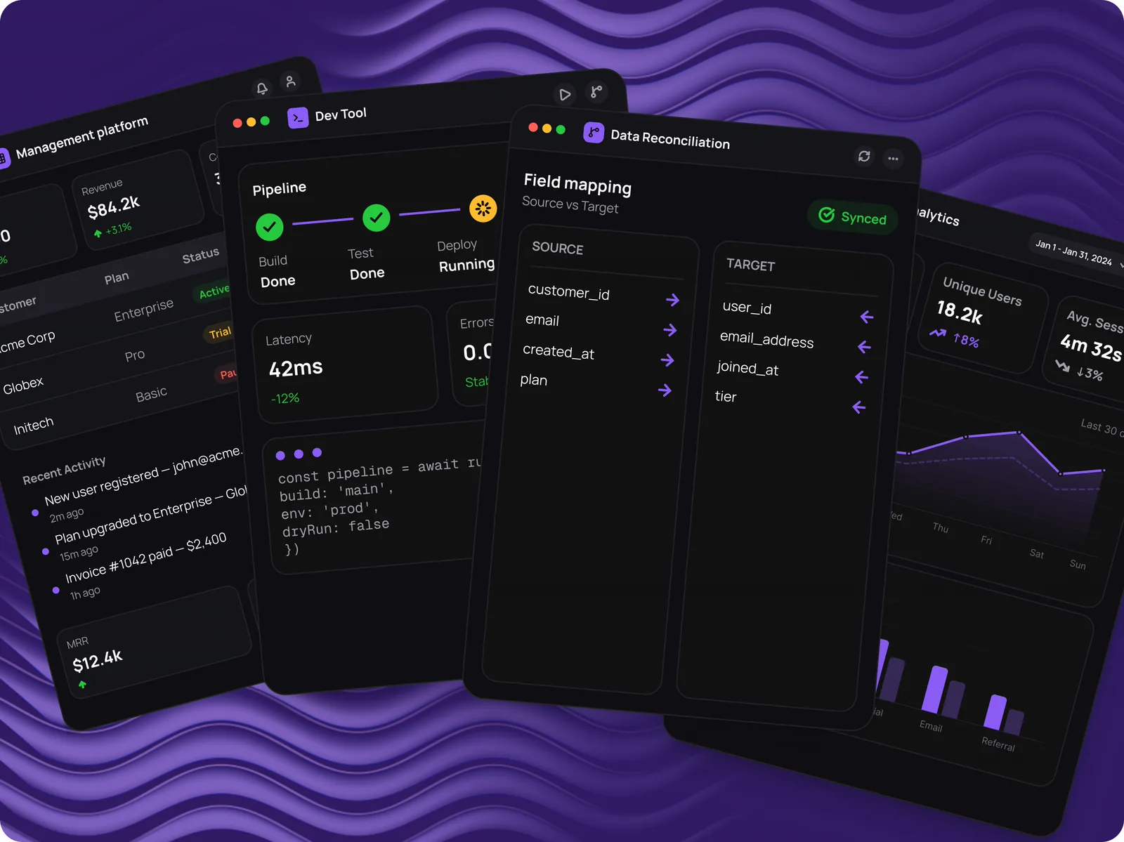
An internal enterprise platform, a tool for contracts and data reconciliation, a developer tool and an analytics platform at MVP. All four needed a design system built from scratch.
0→1 Design
Enterprise B2B
Design System
NDA
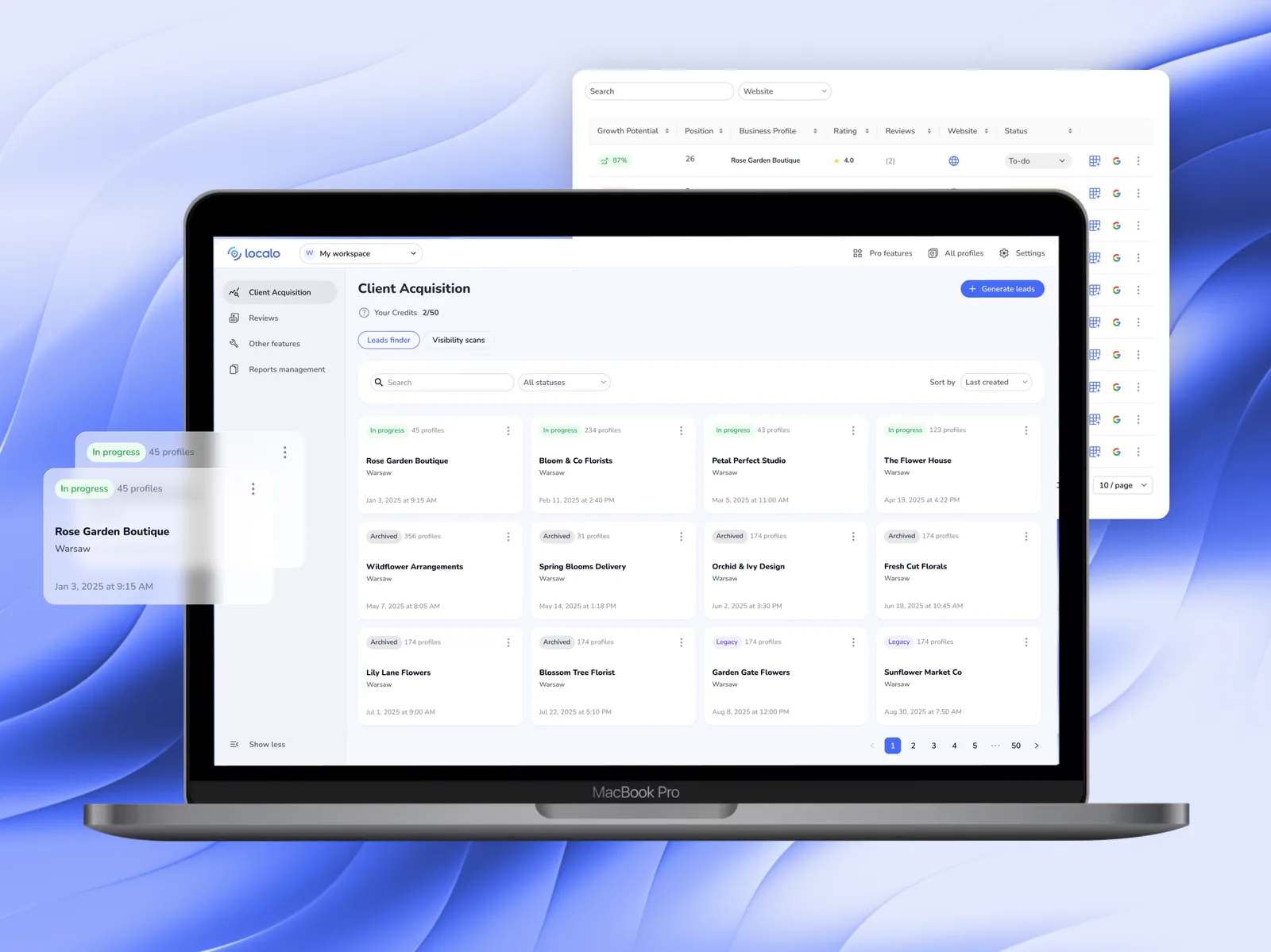
Localo · Client Acquisition

Localo · Client Acquisition

Almost nobody switched the feature on themselves — its value only landed on a call with Customer Success. After the redesign, sessions on the feature grew 2.5× and median time on it rose 81%.

Redesign
B2B2C
SaaS
Workflow Optimization

Side projects

PlanujemyTo

PlanujemyTo

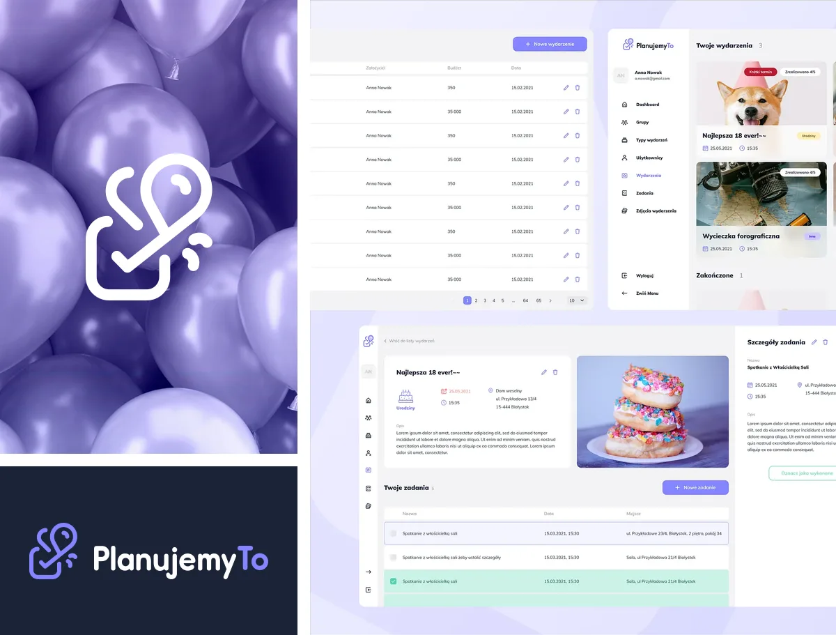
Free event-planning app — brand, product and design system.
0→1 Design
Brand Identity
Design System
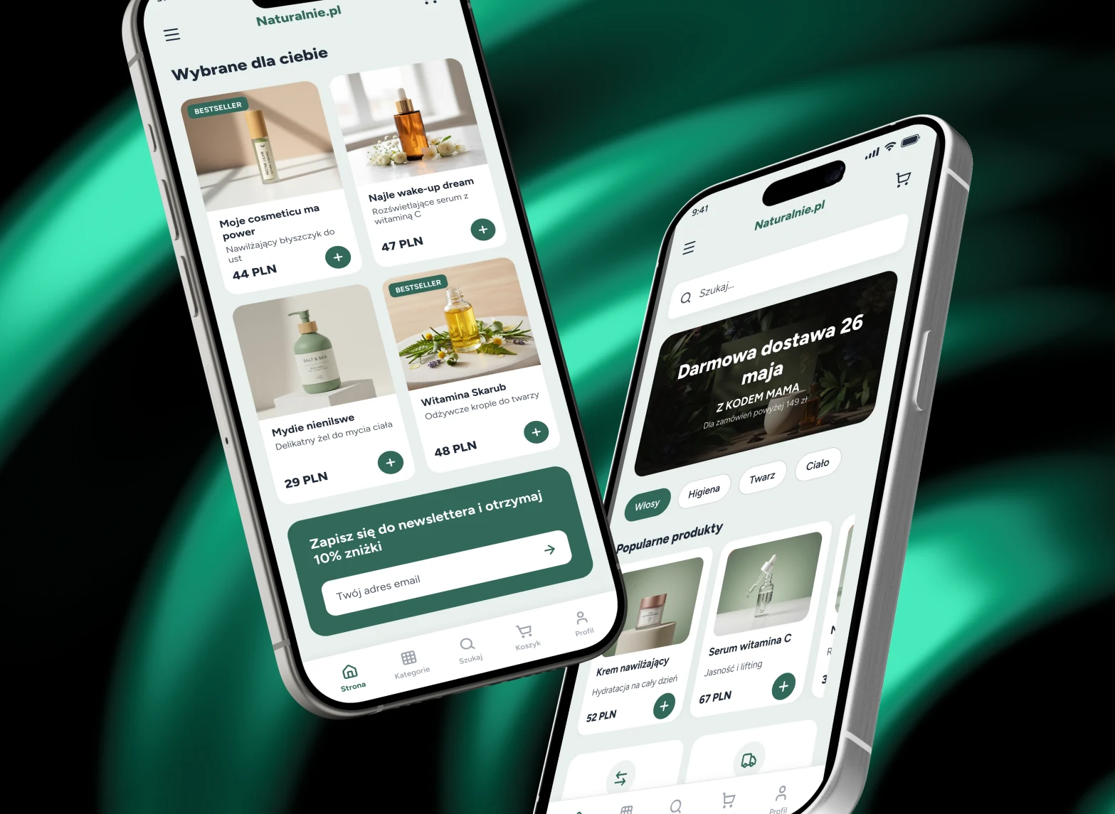
Naturalnie.pl

Naturalnie.pl

Mobile UI concept for a natural cosmetics and personal care online store.
Redesign
E-commerce
Mobile Design
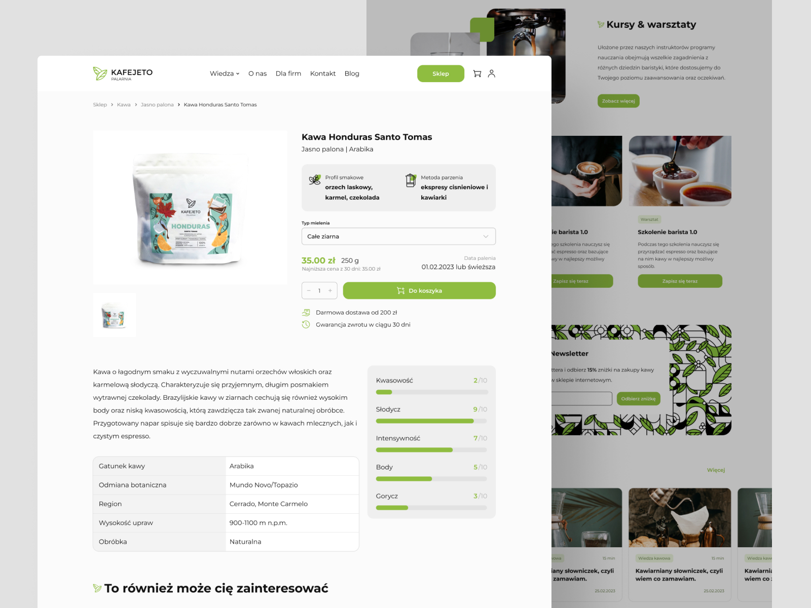
Kafejeto.pl

Kafejeto.pl

Online store for a Polish specialty coffee roastery — fresh coffee, accessories, training.
UI Design
E-commerce
Responsive Web
Banner Revolution

Banner Revolution

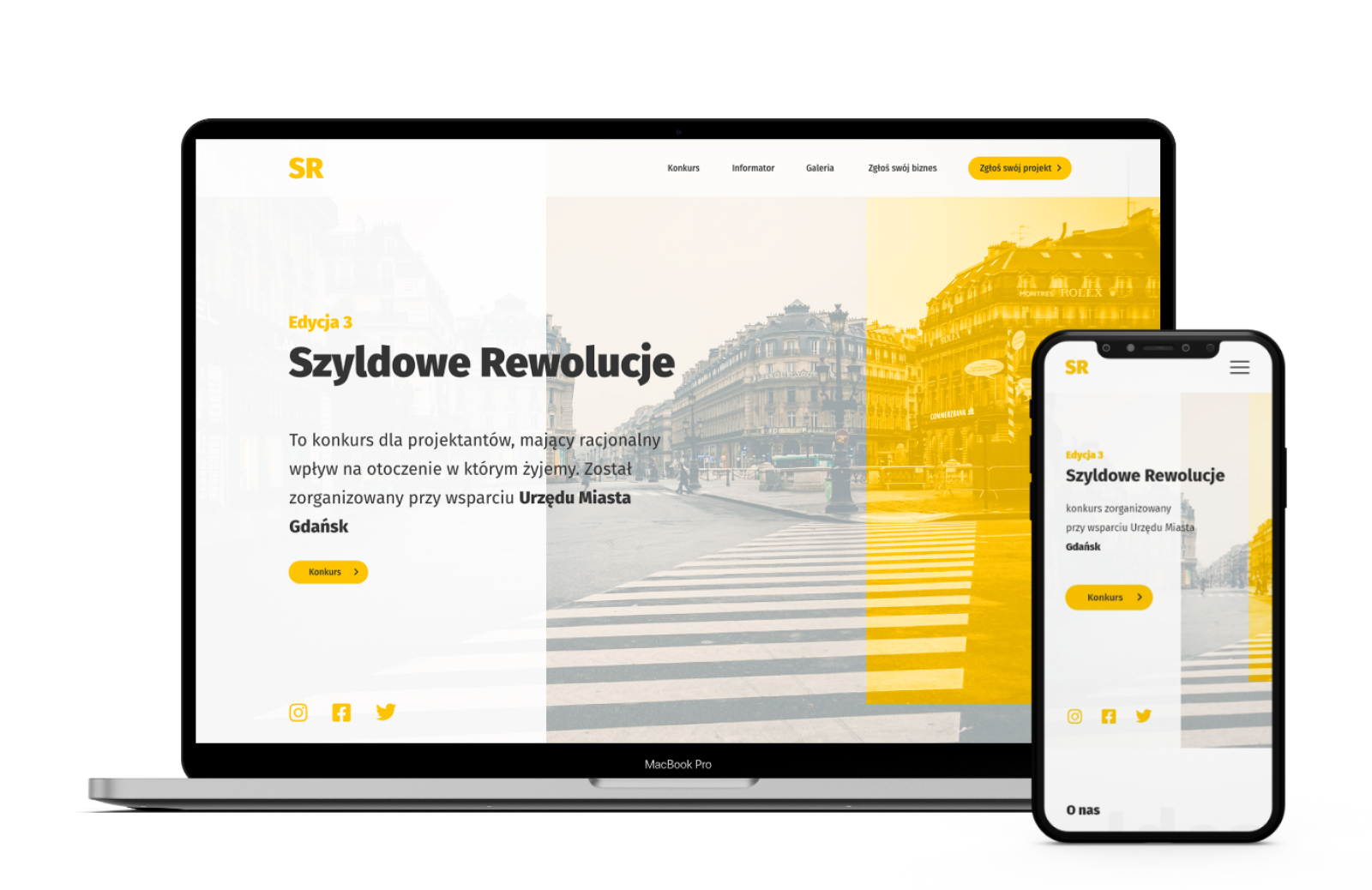
Competition website for designers fighting advertising chaos in urban space.

0→1 Design
Non-profit
UX Research

Let's talk

Want to talk about a project, learn more about the process, decisions, and context? Find me on LinkedIn or just send an email : )
CASE STUDY—SZYLDOWE REWOLUCJE · DESIGNER COMPETITION
Banner Revolution. Competition website for designers.
0→1 Design
Non-profit
UX Research

A conceptual website project for the Szyldowe Rewolucje competition, an initiative fighting advertising chaos in public space. The competition engages designers to create aesthetic, legally compliant signage for local businesses, with winning designs realized in urban space. The project was created as part of postgraduate studies in UX design | web analytics at the Białystok University of Technology.

Product

Szyldowe Rewolucje

Type

Designer competition

Tools

Adobe XD · Miro

Scope

UI/UX · Web concept

Banneroza, cover
My role

Research → prototype — user interviews, analysis, wireframes, usability tests. Project created as part of postgraduate studies in UX design | web analytics at Białystok University of Technology.


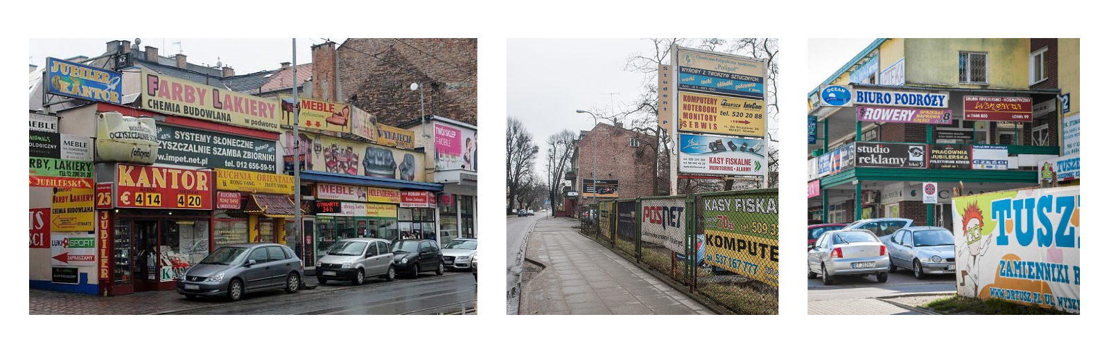
Banner disease in urban space

Illegal and unaesthetic advertising pollutes public spaces in Polish cities. Local governments fight this, but the task is difficult: it requires raising awareness among residents and businesses, and involves significant costs.

Design question: how to encourage the local community (residents, businesses, local governments) to care about the aesthetics of urban space and make it easier to change the environment we live in?

Problem, banners in cities

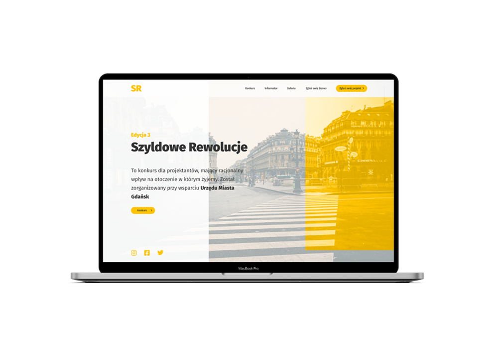
Szyldowe Rewolucje

A competition for designers with a real impact on the visual change of urban space. Organized with the support of local governments that have already adopted a landscape resolution. The winning design isn't shelved, it's realized in urban space.

This gives designers a cash prize plus real impact on fighting banner disease, while local businesses receive professional, legally compliant outdoor advertising.

The project includes designing the competition website.

Szyldowe Rewolucje, solution

What the research revealed

First, we tried to understand the real problem behind the banners. We conducted desk research and created a list of research questions as a team.

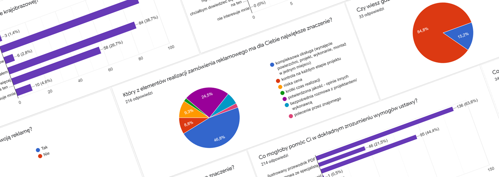
We decided to survey city residents (all age groups) to gather their opinions. To reach as large a group as possible, we ran quantitative research.

Research questions

  • →What is the real problem with urban advertising?
  • →How widespread is social awareness? What do people think about this problem?
  • →Who takes action to solve the problem, and how?
  • →Has anyone already tried to solve this problem? What were the results?
  • →Are the messages on banners useful?
  • →Where are advertisements particularly problematic?
Research, quantitative data

Key insights

Lack of knowledge about landscape law

Most people don't know such regulations exist.

Difficulty understanding the law

The act is too complex to interpret independently.

Low problem awareness

Advertising chaos is treated as normal, not a problem.

Lack of engagement

Awareness of the problem rarely translates into action.

Need for a credible source

The initiative must be backed by authority, e.g. the City Office.

Need for an illustrated guide

A simple, visual guide with legal requirements, that's what's missing.

Persona

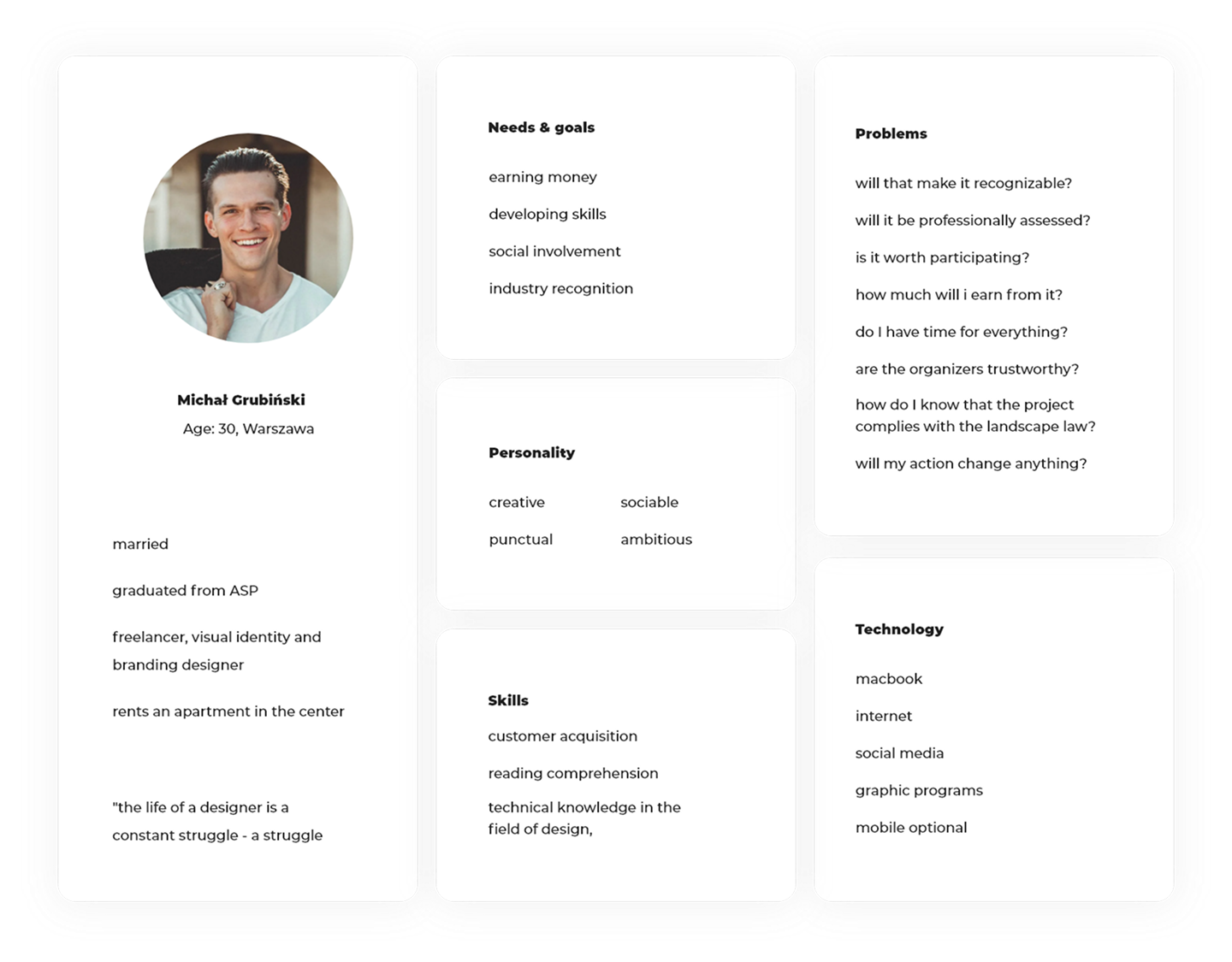
Based on the data collected, we created a persona, to keep in mind who we're designing for throughout the process.

Persona

From information architecture to wireframes

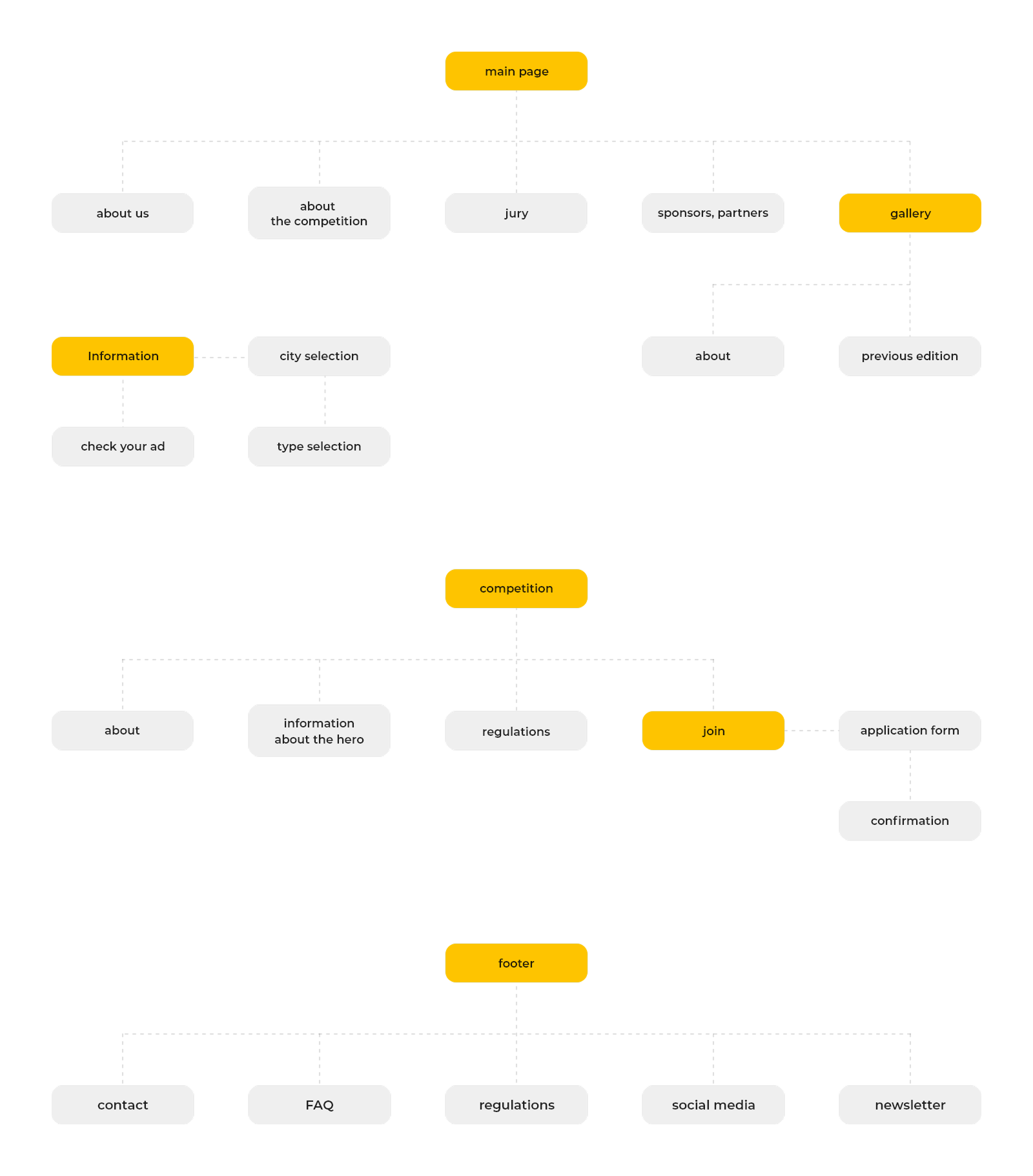
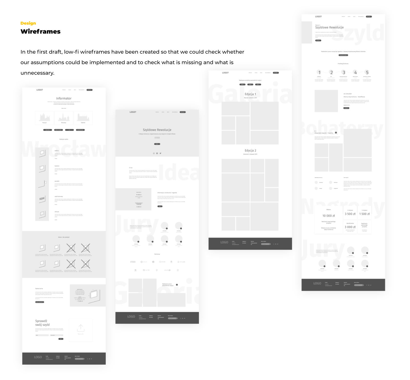
Based on the research, we designed the site's information architecture: the homepage, competition section, guide, gallery of previous editions and submission form. In the first iteration, low-fi wireframes were created, allowing us to verify assumptions and catch gaps before moving to high fidelity.

Information architecture

Low fidelity wireframes and High fidelity mockup

Low fidelity wireframes

In the first iteration we created low-fi wireframes to check whether our assumptions were achievable and to catch gaps and redundant elements before moving to the actual design.

Low fidelity wireframes

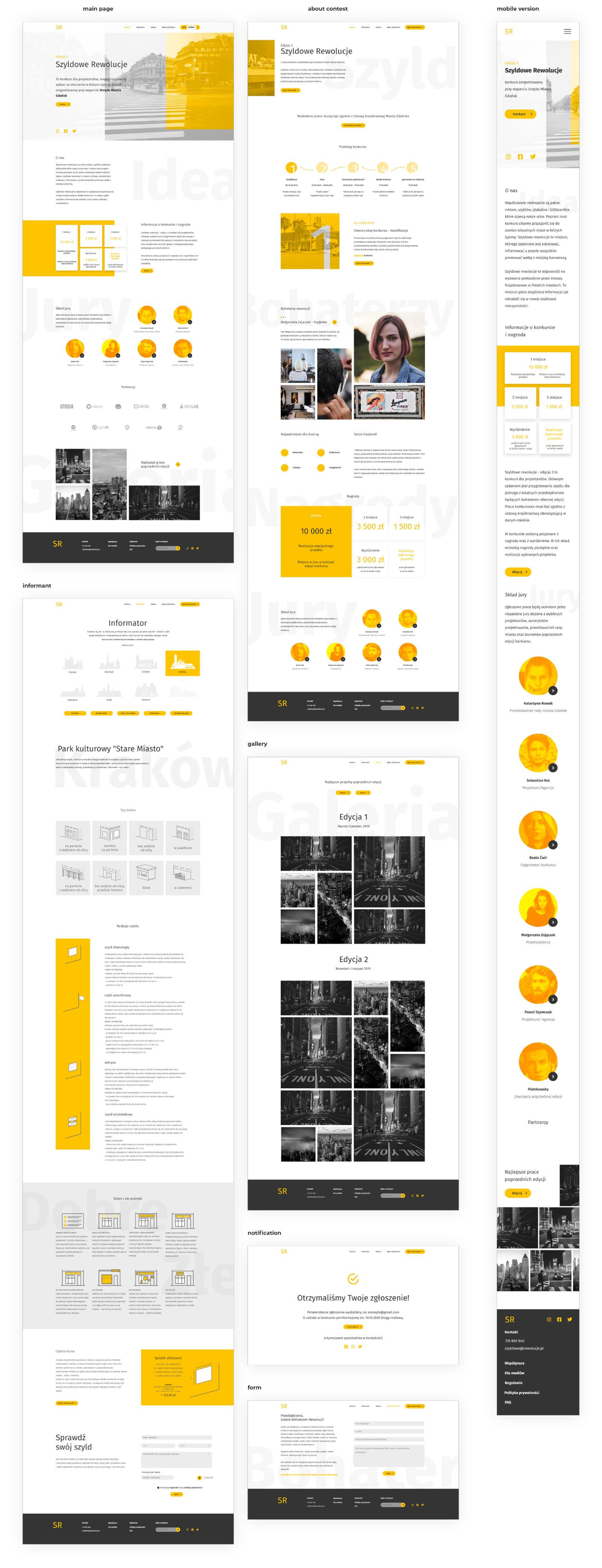
High fidelity mockup

The final design was based on a yellow-black color palette referencing urban signage and markings. The goal was to create a readable, minimalist and accessible site, on both desktop and mobile. The design covers the homepage, legal requirements guide, edition gallery, submission form and confirmation screen.

High fidelity mockup

What I would do differently

Usability tests were the most valuable moment of the project: watching real users interact with the product verifies assumptions that seem obvious during design.

1

Accessibility is foundational, not optional

Entering the project I focused on aesthetics and structure, treating accessibility as a later step. Tests showed that contrast and text alignment genuinely block users, not just those with disabilities. Next time, I start with accessibility.

2

Designer language ≠ user language

Terms that were obvious to me, users interpreted differently. I learned that every piece of communication needs testing, especially in forms and multi-step processes.

3

Information hierarchy over completeness

I wanted to show everything. Users wanted to find one specific thing. I learned to design around the question 'what does the user want to see first', not 'what do I want to show them'.