Hi, I'm Edyta, Product Designer

I build products end-to-end
with AI and eyes on real people.

B2B
B2C
SaaS
8+ years exp
AI-oriented
Product Strategy, User Research, Design Systems, Prototyping, Discovery & Delivery, B2B SaaS, End-to-End, Visual Craft, UI, UX, AI

Selected case study

Localo · Report Builder

Localo · Report Builder

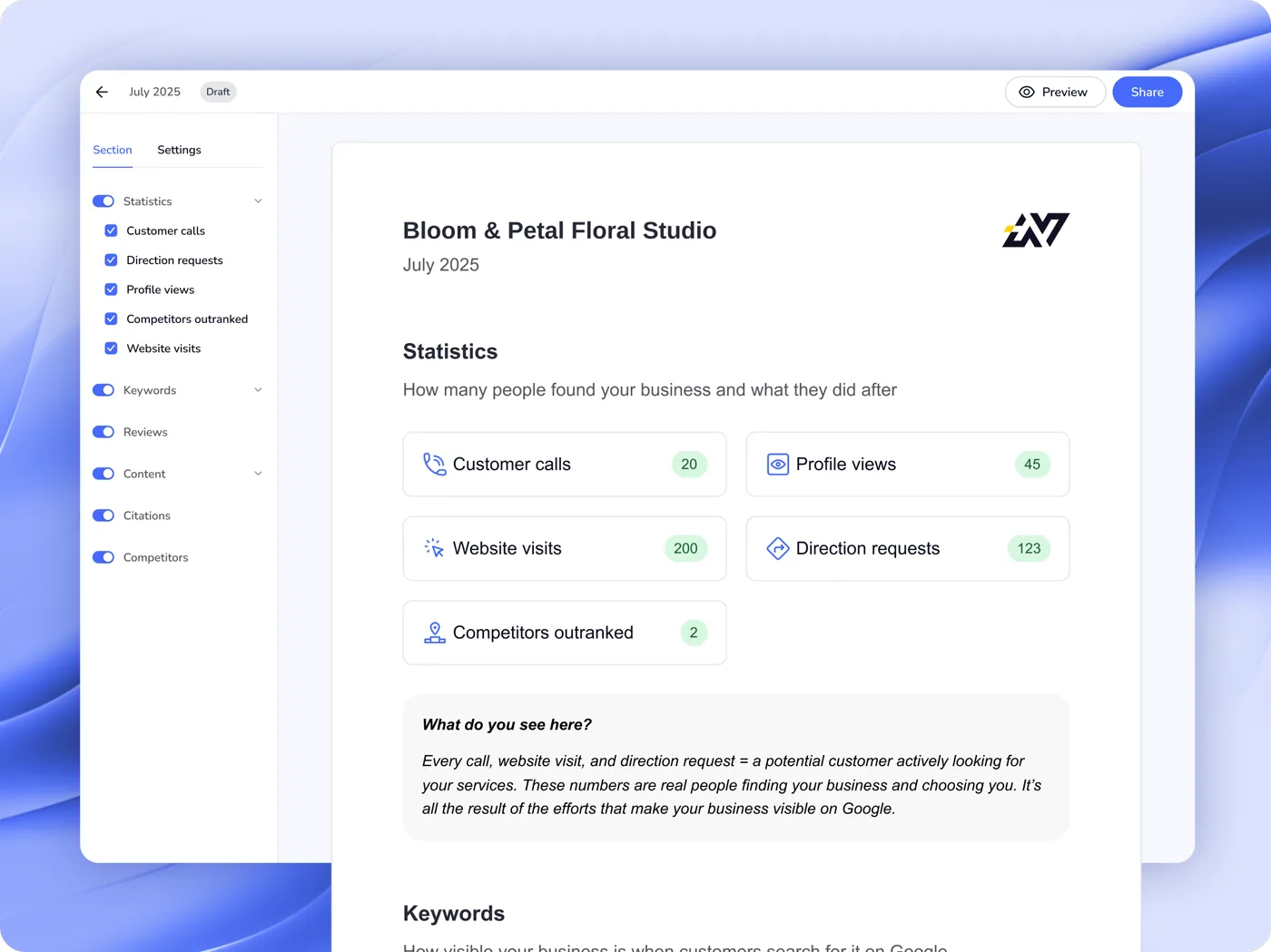
Agencies used to piece client reports together from screenshots, several hours a month. Today 60% of report users generate and send them automatically.
Product Design
B2B2C
SaaS
UX Strategy
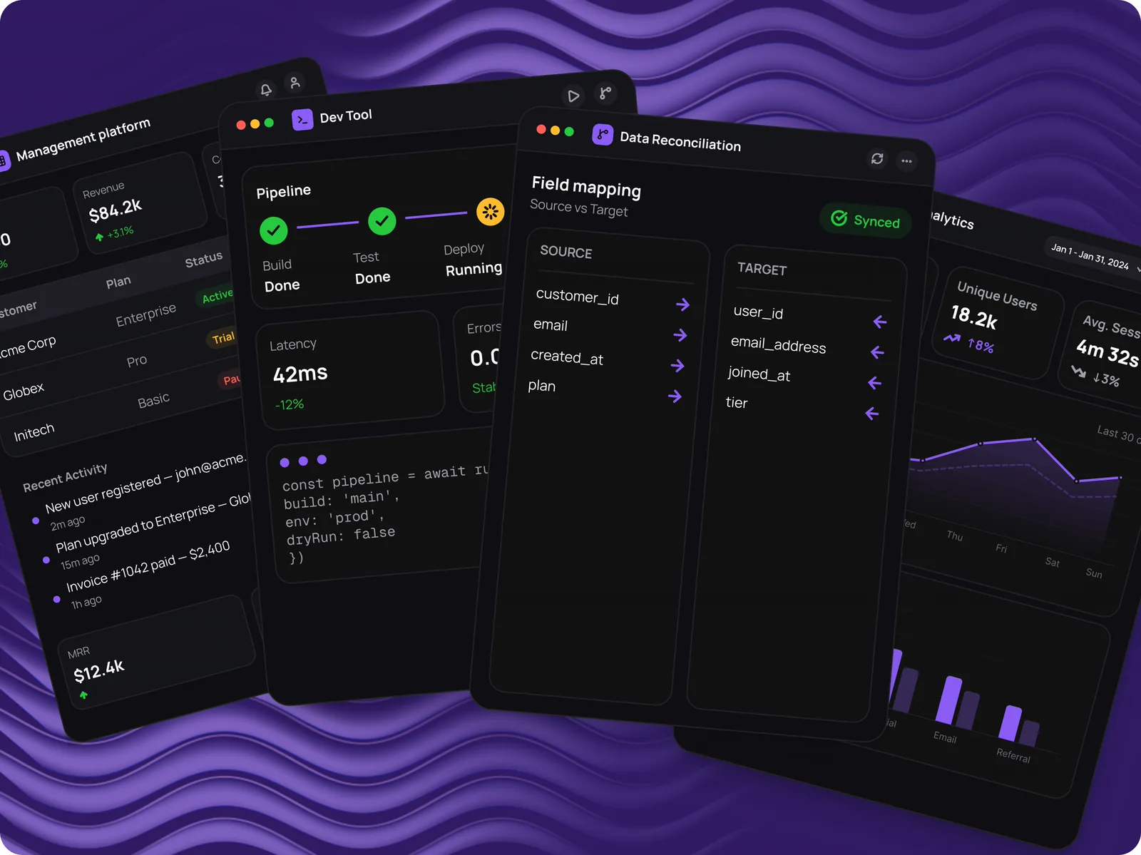
Codete · Four B2B products

Codete · Four B2B products

An internal enterprise platform, a tool for contracts and data reconciliation, a developer tool and an analytics platform at MVP. All four needed a design system built from scratch.
0→1 Design
Enterprise B2B
Design System
NDA
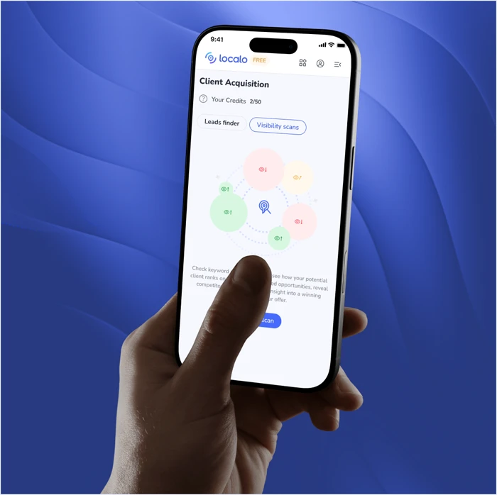
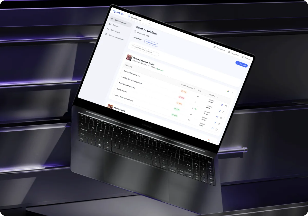
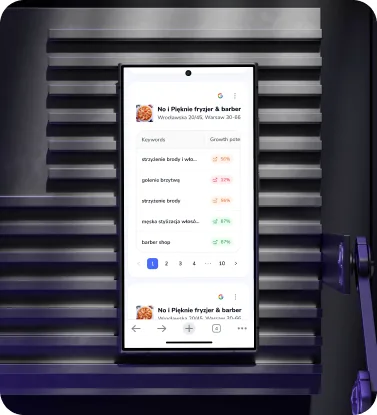
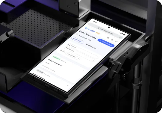
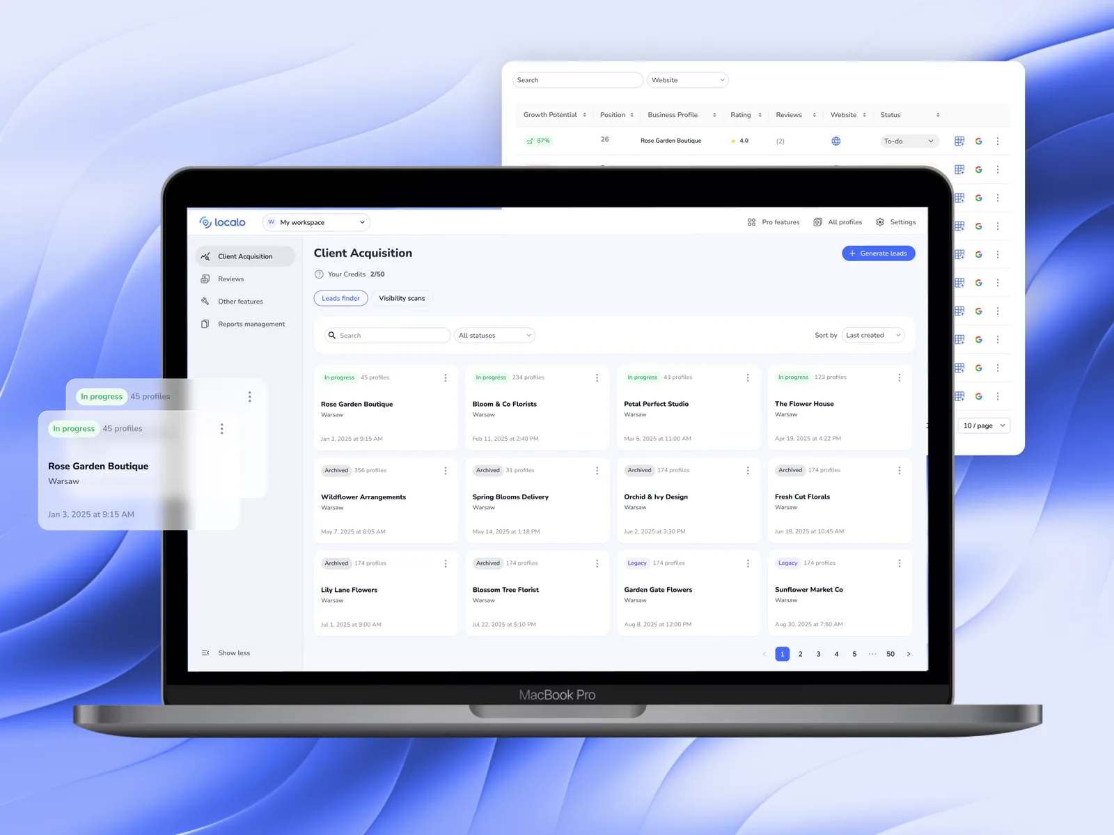
Localo · Client Acquisition

Localo · Client Acquisition

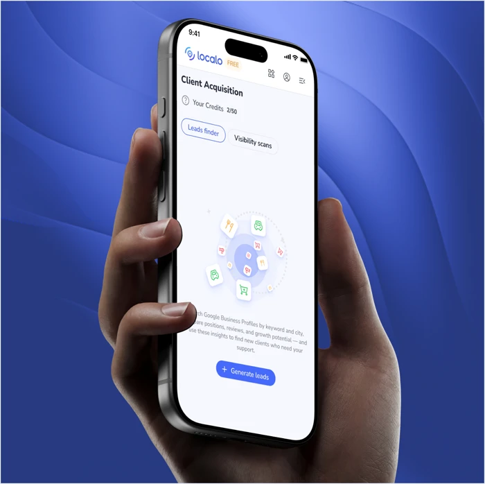
Almost nobody switched the feature on themselves — its value only landed on a call with Customer Success. After the redesign, sessions on the feature grew 2.5× and median time on it rose 81%.

Redesign
B2B2C
SaaS
Workflow Optimization

Side projects

PlanujemyTo

PlanujemyTo

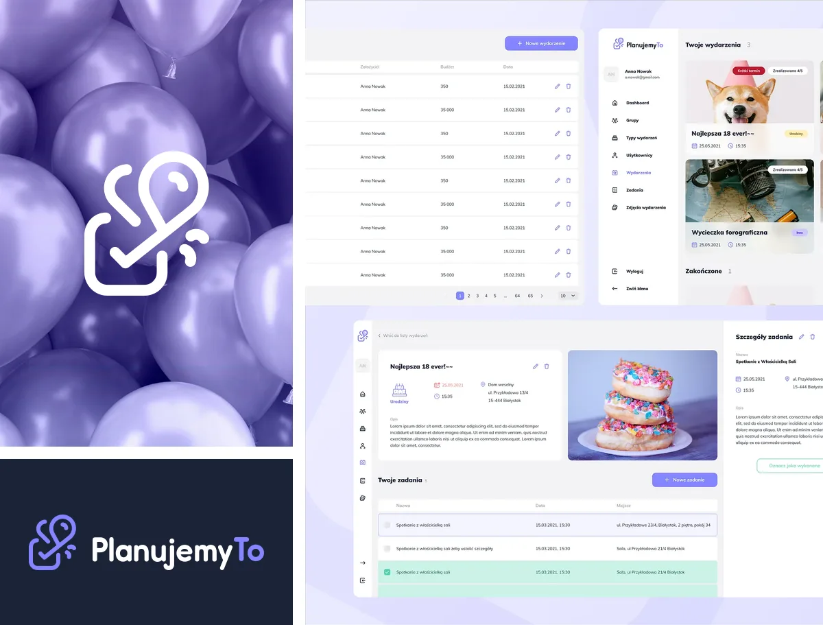
Free event-planning app — brand, product and design system.
0→1 Design
Brand Identity
Design System
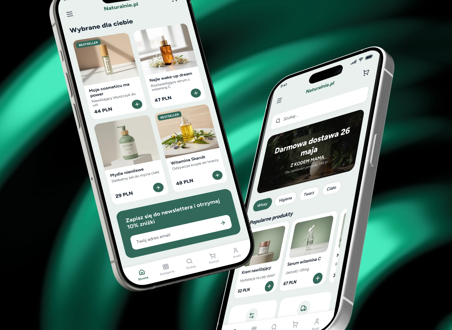
Naturalnie.pl

Naturalnie.pl

Mobile UI concept for a natural cosmetics and personal care online store.
Redesign
E-commerce
Mobile Design
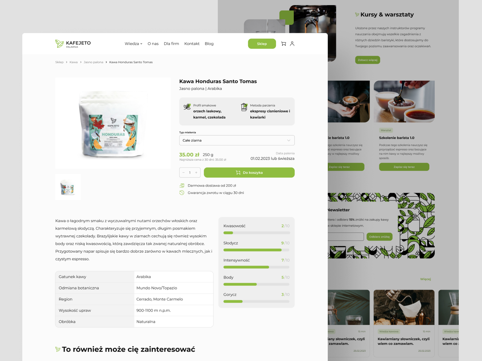
Kafejeto.pl

Kafejeto.pl

Online store for a Polish specialty coffee roastery — fresh coffee, accessories, training.
UI Design
E-commerce
Responsive Web
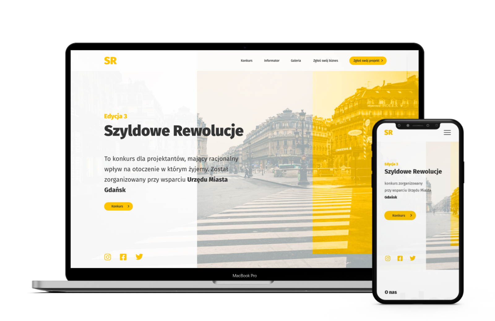
Banner Revolution

Banner Revolution

Competition website for designers fighting advertising chaos in urban space.

0→1 Design
Non-profit
UX Research

Let's talk

Want to talk about a project, learn more about the process, decisions, and context? Find me on LinkedIn or just send an email : )

CASE STUDY - LOCALO · CLIENT ACQUISITION

One flow for client acquisition.

Redesign
B2B2C
SaaS
Workflow Optimization

Lead generation and visibility research existed in Localo separately. Both worked, but almost nobody launched them on their own — the value only reached people on a Customer Success call. On top of that, both ended up in an external CRM or a spreadsheet. I designed Client Acquisition: one tool with two modules that explains itself and closes the loop without leaving the product. After the redesign, median session time on the feature grew from 4.0 to 7.3 minutes, and the number of onboarding calls dropped.

PRODUCTLocalo
SCALE6,700+ users
INDUSTRYLocal SEO / B2B SaaS
USERSFreelancers, SEO specialists, agencies
for client acquisition.
01 · CONTEXT, IMPACT & ROLE

Long story short

Localo is a tool for people managing Google Business Profiles — one or dozens at a time. It automates the work and tells you what to do next: a weekly task list with priorities for every profile, audits in seconds, reports ready to send to a client in minutes.

Brief — Client Acquisition

The feature was built as an MVP by a single developer and stayed exactly as it was. Nobody on the team pretended it was good.

“We know the UX and the overall design of this feature is weak — users only understand the tool's value, and how to use it at all, after onboarding with Customer Success on a call. We want users to come in, see the wow effect, and use it on their own.”

This wasn't a project where the problem had to be discovered. The problem was known - the entire job was figuring out how to solve it.

How the metrics changed:

+0%longer median session on the feature: 4.0 → 7.3 min
0.0xmore likely to pay than the rest of the base: 28.0% vs 5.1%
~0xhigher blended LTV for feature users: $149.97 vs $16.31
The last two compare feature users against the rest of the base, not a before/after measurement. I break this down in chapter 07.
MY ROLE — DESIGN LEAD, END TO END

At Localo I owned the entire product — from discovery to delivery.

  • defined the problems
  • led research and designed the UI/UX
  • tested with users and iterated
  • advised on what made the roadmap and what didn't
  • grew the design system and maintained it together with engineering
  • joined client calls, so I wasn't relying on someone else's notes
  • mentored a junior product designer

Redesign: Research & Sales mode

MY SCOPEexpert audit of the existing feature, new information architecture, user journey and flow, naming, UI, states and messaging, handoff, design QA.
COLLABORATIONscope and priorities. Engineering team — technical constraints, from day one. Customer Success — insight into what people didn't understand on calls. Plus support from QA and the writer.
02 · Knowledge gathering

The knowledge already lived in the team

Client Acquisition reached people whose behavior I'd already studied on other projects at Localo. So I went in with a ready persona and knowledge of how they work day to day and what they need.

WHO IT'S FOR (PERSONA)
Freelancers, SEO specialists, and people at agencies responsible for client acquisition.

What they have in common: they don't come for data — they come for an answer to who should I call tomorrow and what do I show them.

Sources of knowledge and key findings

The project scope didn't call for fresh discovery or deeper research. I relied on four sources that spoke directly to this feature: my own expert audit, session recordings, support tickets, and Customer Success's knowledge.

Expert audit

Experience
Nielsen's 10 heuristics
Guidelines & best practices
Accessibility

On top of that, I looked for information in these places:

Session recordings in Clarity

The audit tells you what's broken by the rules. Recordings tell you where people actually stop, what they click, and at what point they close the tab.

Conversations with Customer Success

They'd explained this feature live dozens of times, so they knew things about it that don't show in the interface: exactly what they tell clients, what users struggle with most, and the moment the lightbulb goes on.

Support tickets

I went through the tickets about the feature: a list of frustrations, problems, and requests for help. Questions about credits kept coming back — and that report later became a concrete change in the project.

Session with engineers

I pulled in the engineering team before I sketched anything. I wanted to know how the feature works today and why, what our technical constraints are, what's blocking us, and what we already know we want to drop or move to a different stack.

AI-assisted research synthesis

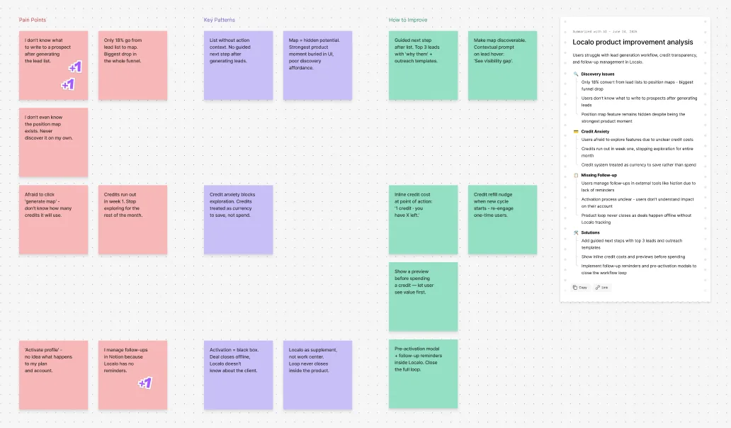
I combined the Clarity recordings, support conversations, and expert-audit findings using Claude. I wanted to see where the observations overlapped, whether patterns emerged, and which recorded frustrations came up most often.

Key findings

01High barrier to entry

Every new user needed manual onboarding from CS. Walking into the tool, they had no idea what they'd get.

02Results weren't repeatable

The same query could return a different list, with no way back to the previous one — no snapshots, no search history.

03No continuity

Leads lived in Sales mode, visibility data in Research, with no shared context and no visible link between them.

04External tools

One task, several exits from the tool. A lead was a row with no data to decide on — no site, review count, or map link, those were still project goals — while contact status and notes lived in someone else's spreadsheet.

05Invisible cost

No communication of limits. Nowhere did it say how many credits a user had, what an action cost, or what happens when they run out.

Scope — what we're doing and what we're not

Together with the PM and the team, I nailed down exactly what was in scope for the redesign. That included: stabilizing list generation, a micro-CRM with lead statuses, a better lead preview, communicating limits, communicating value, naming, and a visible link between both halves of the feature. We deliberately excluded three things:

How keywords are added.

We used it in other parts of the app, so changing it here would mean rethinking it everywhere. That needed a project of its own.

Result history.

It only becomes worth something once people come back to the feature. First we had to check whether they would.

Buying extra credits.

Bundles, price tiers, one-off billing or added to the subscription — that's a pricing-model decision and needs a conversation with the business.

That list did two things: it kept us disciplined — whenever we drifted off with ideas, we came back to the "agreement," which kept us from burying ourselves in one project for six months. It also aligned expectations: the manager knew what the output would be, and the engineers and I knew what we were responsible for.

As always, and this time too, I put together a goal that was presented to and approved by the team. That way, at every stage of the project, we remember who it's for and why we're doing it.

GOAL

Take the burden of explaining the feature off the team. Users should walk in, see the result, and keep using it on their own — no call, no instructions, no leaving for outside tools.

03 · Process

The path first, then the screens

New flow, before the first screen existed

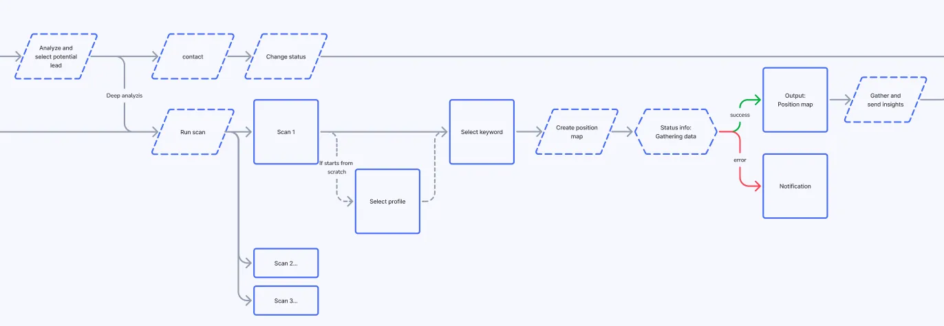
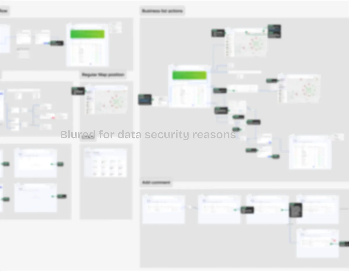
I remapped the entire user journey from scratch: from finding a business, through lead scoring and a visibility scan, to the material to send, contact status, and profile activation. This wasn't redrawing what already existed — neither of the two modes carried the whole journey, so it had to be assembled.

The map gave the team a shared picture of the scope, surfaced edge cases before they became a design problem, and set the structure the entire feature was later built on.

Low-fi, before anything looked like anything

Before the polished mockups, I made a draft and a low-fi prototype. I wanted to check the layout, but mainly to make sure we understood how the feature works today and how we wanted it to work. With a feature someone else had built earlier, that's not obvious — not to me, and not to the team.

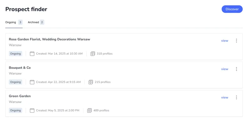
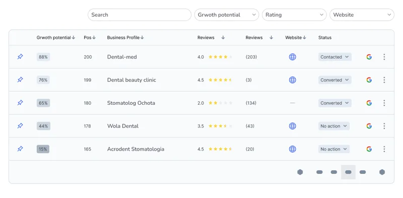
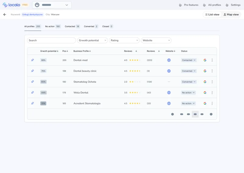
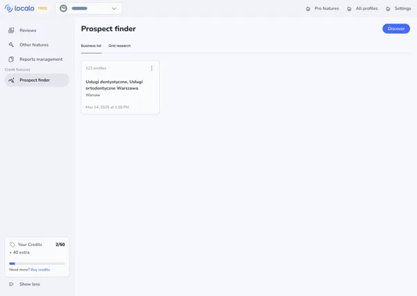
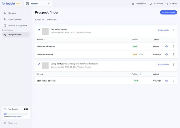
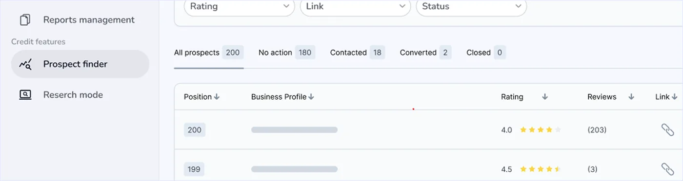
Prospect finder: listaProspect finder: tabela z filtramiProspect finder: widok pełnyBusiness listProspect finder: listaProspect finder: tabela z filtramiProspect finder: widok pełnyBusiness list
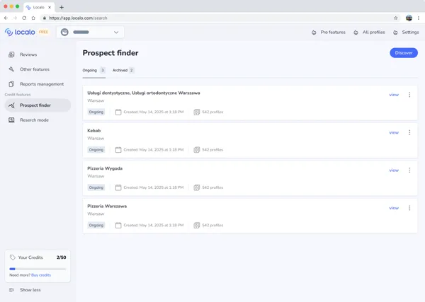
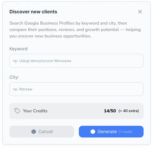
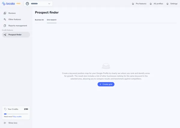
Grid researchOngoing / ArchivedDiscover new clients: modalGrid research: pusty stanGrid researchOngoing / ArchivedDiscover new clients: modalGrid research: pusty stan

Key decisions

One place to work from
Rejected option:

keep Sales mode and Research mode separate, linked by navigation and onboarding. Logically clean — one is analysis, the other is sales.

Reason:

the work is sequential — first find the business, then prepare material for it. Going from "oh, a potential client" to "generate them a position map" needed to be one motion, and the line between modes ran right through it.

Names tell you what happens

Sales mode and Research mode → Client Acquisition with two modules: Leads finder and Visibility scans. The old names described the tool's working mode; the new ones describe what the user gets. It looks cosmetic, and it was one of the cheapest changes that raised how understandable the feature was. The name is the first tooltip a user sees — and the only one they can't skip.

One score instead of five numbers

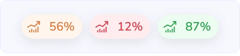
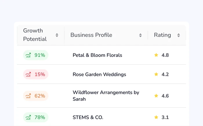
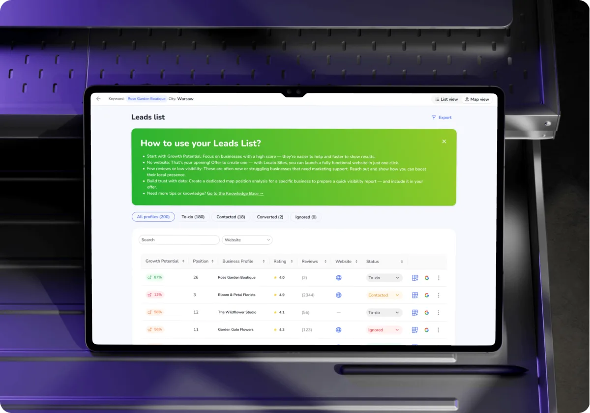
Leads get a Growth Potential score — one value that speeds up filtering potential clients.

Reason: raw metrics pushed the "is this worth it" calculation onto the user, and that needs knowledge and time to analyze. The raw data stayed, but from now on it's only used for deeper analysis — Localo does the first pass.


04 · Final solution

From lead to client

Below is the final solution. The user enters an industry and city, gets a list of businesses, and picks the one where showing results will be easiest. They check its visibility, send a position map under their own brand, and note what they agreed on the phone. When the client says yes, they activate their profile. All in one tool, from the first search to the first day of the partnership.

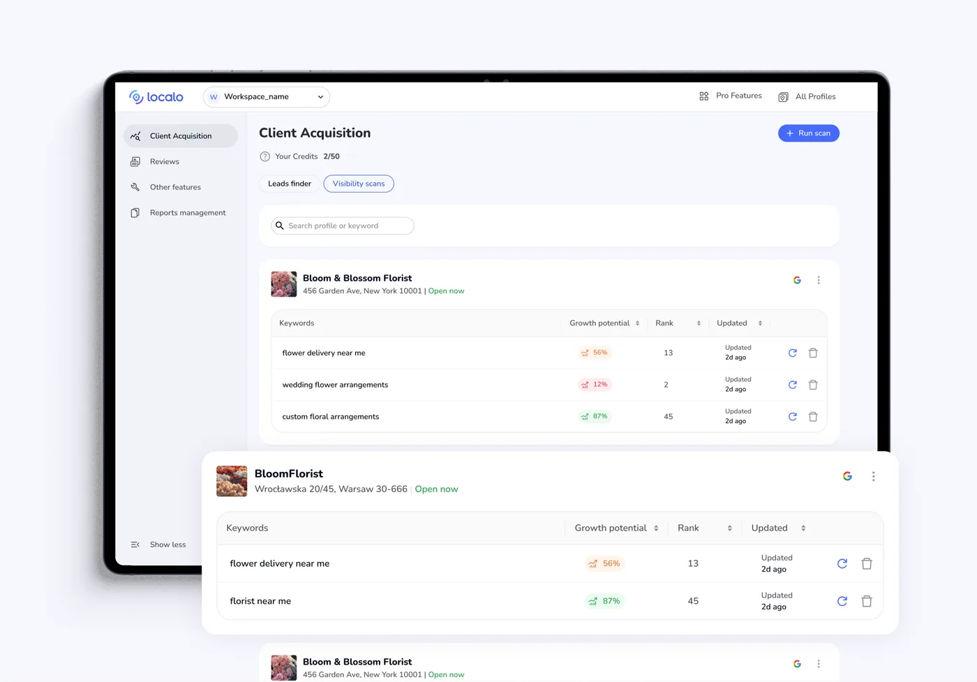
Leads Finder — finding potential clients

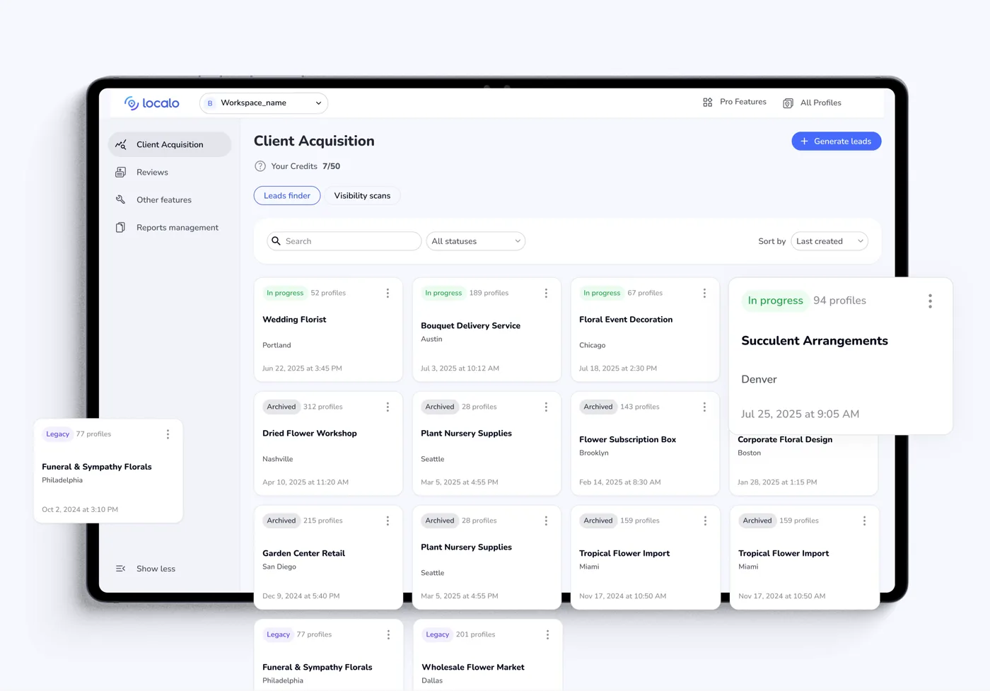
A separate list for every search

Every project is a leads list built around one keyword and one location — dentists in Torun and hairdressers in Warsaw can run side by side. The status on the card shows what's in progress, what's closed, and what's still left over from the previous version of the feature.

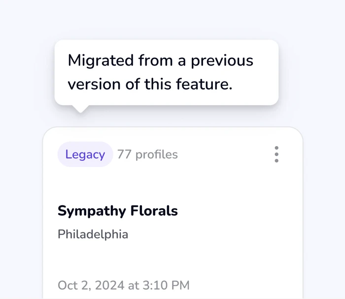
A Legacy tag on migrated lists

Old data couldn't be pulled into the new structure. Migrated lists get a Legacy tag, so it's clear the result might differ slightly from newer ones.

Cost visible before you click

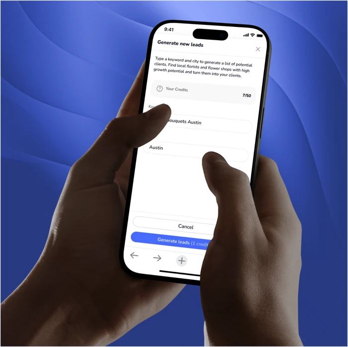
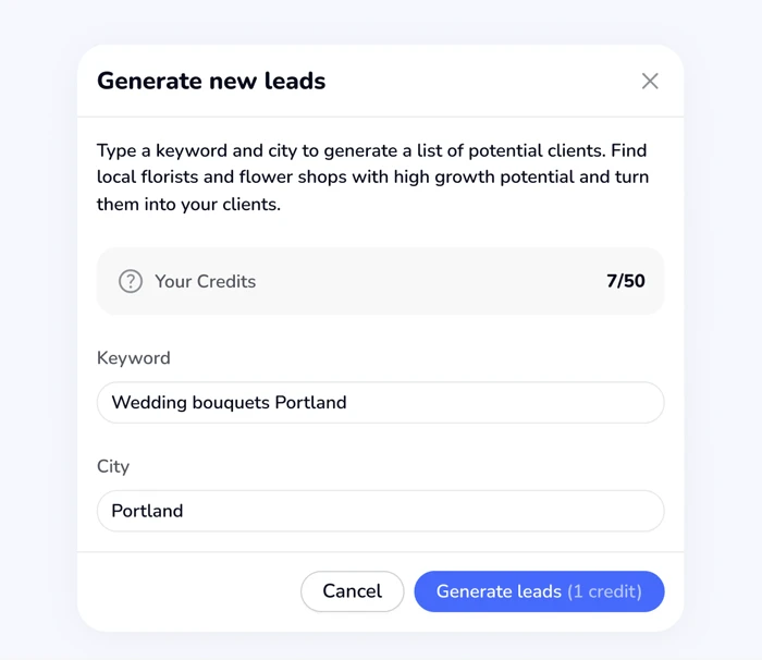
Credit balance and the price of the action sit in the same window where the user types the keyword and location. The limit stopped being a surprise you had to ask support about.

Users shape the list their own way

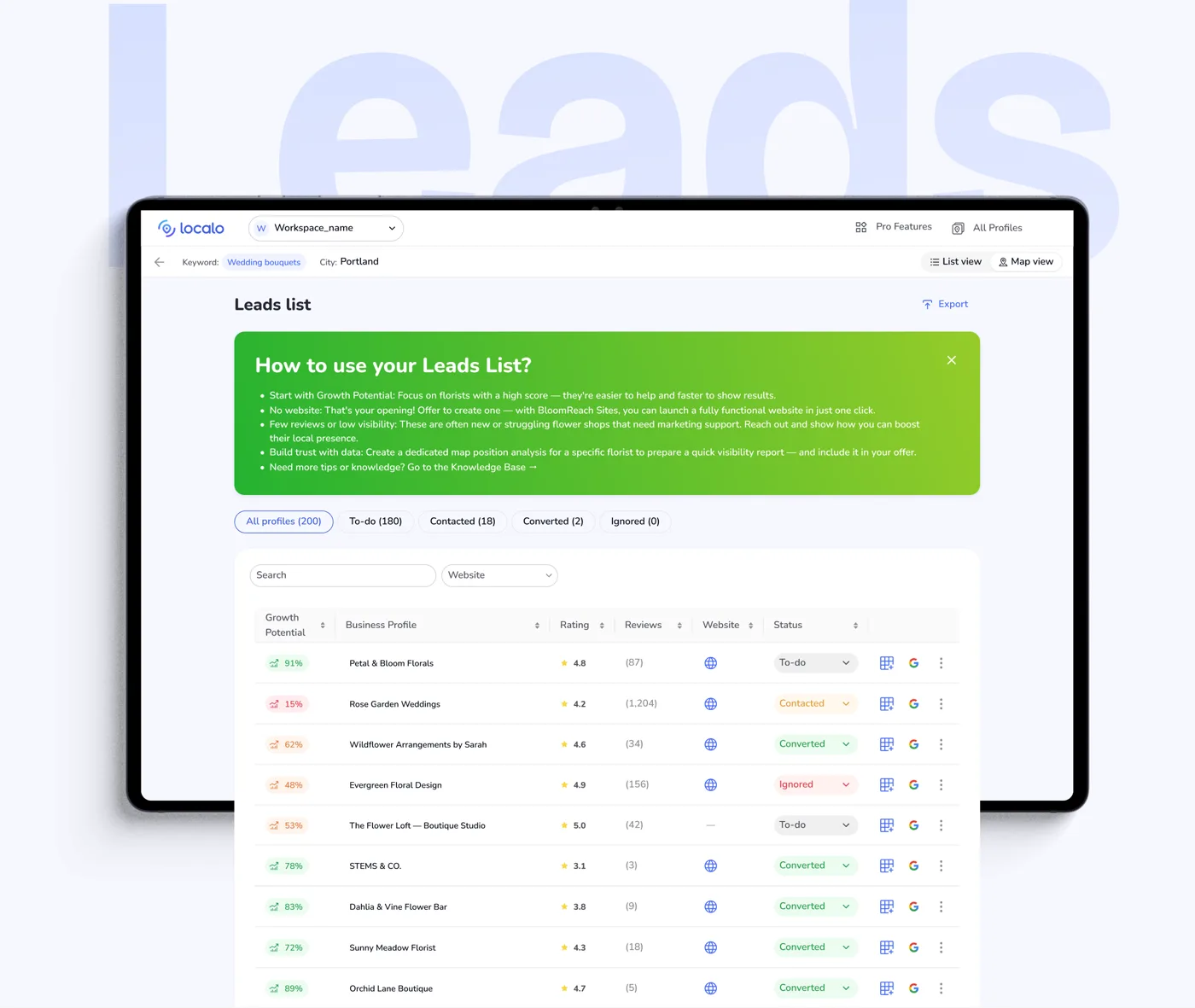
Filters and sorting narrow the list down to the businesses that matter and put them in the order they should be called.

Growth Potential points to the best leads

One value shows how easy it'll be to demonstrate results for a given business. The higher it is, the faster the payoff — the user sorts the list and gets the best leads at the top.

Proof for the call in one click

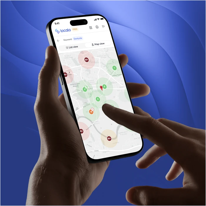
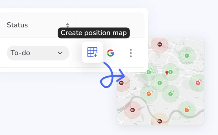
Green dots mean visibility, red means none, orange means a weak position. The position map is generated from the leads list and sent as a link with no Localo logo, under the agency's own brand.

A place for your own notes

For every lead, the user jots down what will help in the next conversation. No need for separate per-client notes.

Contact status on every lead

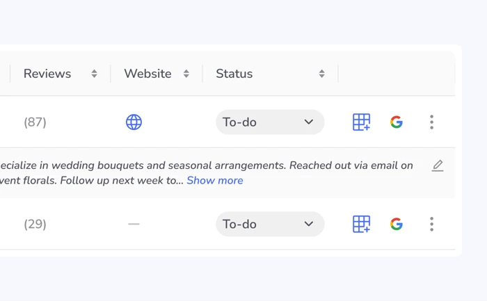
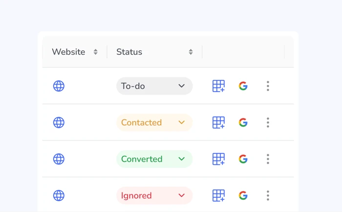
The user marks what stage the conversation with a given business is at, in the same view where they found that business. A spreadsheet kept alongside Localo stopped being necessary.

Sales material without using up a slot

While the conversation is ongoing, the user generates more position maps for more keywords. They pay with credits from their plan, but don't add someone else's profile to Localo and don't use up a slot — the profile stays in Client Acquisition until there's a deal.

Activating a new profile

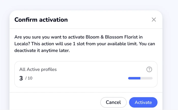
Once the client agrees, the user activates their profile in Localo and starts monitoring and optimization. Only this step uses up a slot in the plan.


05 · Handoff & development

Handoff — what the developers got

Developers got Figma mockups laid out as a flow: every state, notification examples, mobile versions, and implementation notes wherever a decision was needed. On top of that, edge-case descriptions — what happens when there's no data — design-system tokens, and a clickable prototype, so the whole thing could be walked through before writing a single line of code.

I stayed in constant contact with the developers, so questions got resolved on the spot. I checked the implementation on the staging environment and flagged differences from the design. I supported QA in defining what needed testing, and collected fixes after launch.

Blurred for data security reasons

06 · Results

What the numbers showed

+0%longer median session on the feature: from 4.0 to 7.3 minutes. In prospecting, longer means better. Someone who sits in the lead list for seven minutes has started using it.
3,425 → 8,403Sessions on the feature
0.0×Feature users pay more often
0xHigher blended LTV per feature user
Period: August-November 2025 for the old version, December 2025-June 2026 for the new one; the switch happened in December 2025.

What's behind these numbers

The goal from the brief closed beyond the data too. As the CS team reports - the number of onboarding calls dropped, the feature stopped being something they had to explain live.

The feature grew faster than the app itself. The user base went from 4.1k to 6.7k MAU in that time, and the feature's share of active users still rose from ~7.3% to ~7.8%. Holding that share while the base grew by two-thirds means the feature was picking up new people faster than the product was.

People started sticking around in the feature. Median session length grew 81%, session count grew 145%, and events per session barely moved: 11.2 → 12.1. They're not clicking more — yet they're spending more time there. When you're working a lead list and a position map, that's exactly the point.

The feature landed in the most valuable segment. Client Acquisition users pay 5.5× more often than the rest of the base and have roughly 9x higher blended LTV. It's a tool for freelancers and agencies — the people who spend the most in Localo — and it answered a real need for them.


07 · Takeaways

Execution, not discovery

This wasn't a classic project: discovery, research, design, delivery. It's an example of a well-executed assigned task. From the meetings, we knew that once users were introduced to the feature, they saw the value and used it willingly. My job was to make the interface do that, not the team.

Developers' voice in the project matters

I brought engineers in before the first mockup, and that was the best process decision in this project. Legacy data still surfaced along the way and had to be solved with design — a Legacy tag on the card. Talking earlier doesn't guarantee nothing will come up. It guarantees it comes up with you, not in production.

What I'd do differently

We moved testing to production, and there's one thing I'd do differently: Growth Potential. It's the only place where the user hands the decision to an algorithm, and the algorithm went out to people without checking whether its result matched their intuition.