Hi, I'm Edyta, Product Designer

I build products end-to-end
with AI and eyes on real people.

B2B
B2C
SaaS
8+ years exp
AI-oriented
Product Strategy, User Research, Design Systems, Prototyping, Discovery & Delivery, B2B SaaS, End-to-End, Visual Craft, UI, UX, AI

Selected case study

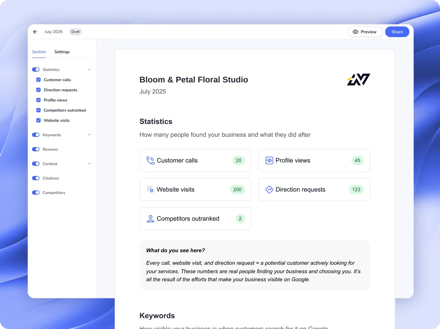
Localo · Report Builder

Localo · Report Builder

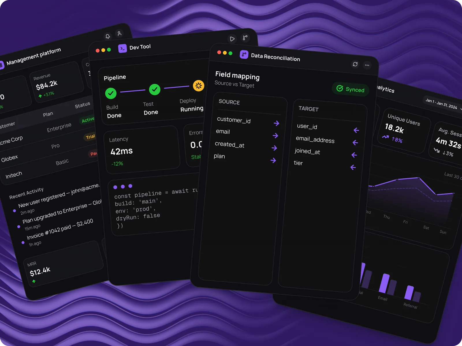
Agencies used to piece client reports together from screenshots, several hours a month. Today 60% of report users generate and send them automatically.
Product Design
B2B2C
SaaS
UX Strategy
Codete · Four B2B products

Codete · Four B2B products

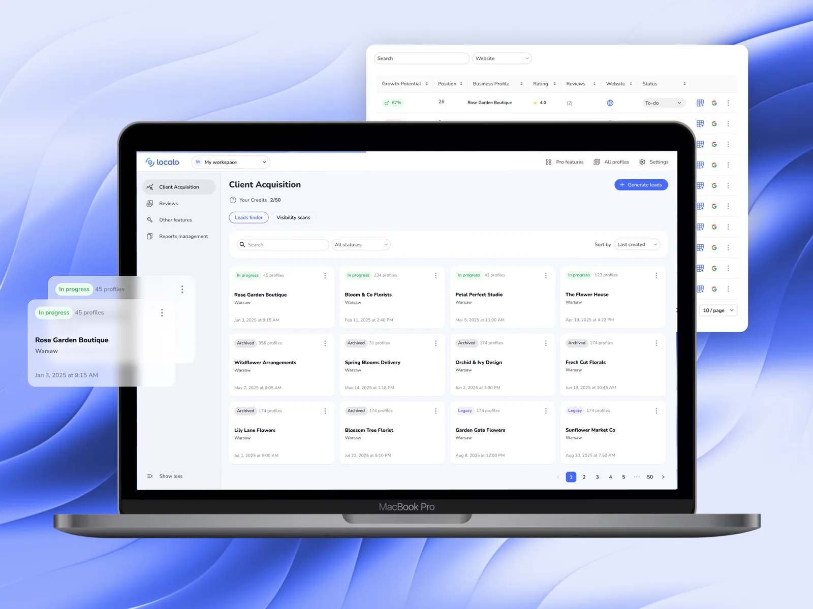
An internal enterprise platform, a tool for contracts and data reconciliation, a developer tool and an analytics platform at MVP. All four needed a design system built from scratch.
0→1 Design
Enterprise B2B
Design System
NDA
Localo · Client Acquisition

Localo · Client Acquisition

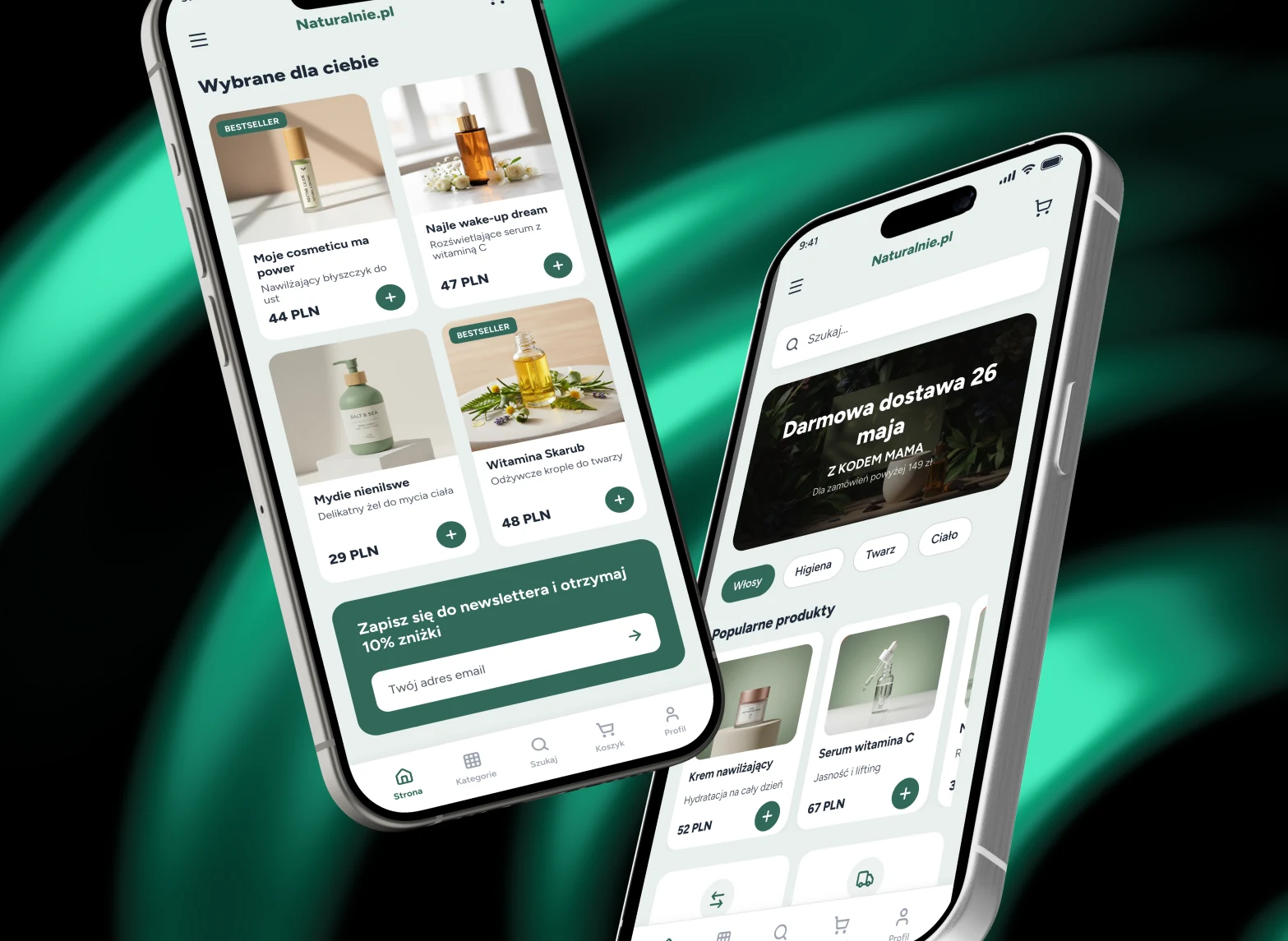
Almost nobody switched the feature on themselves — its value only landed on a call with Customer Success. After the redesign, sessions on the feature grew 2.5× and median time on it rose 81%.

Redesign
B2B2C
SaaS
Workflow Optimization

Side projects

PlanujemyTo

PlanujemyTo

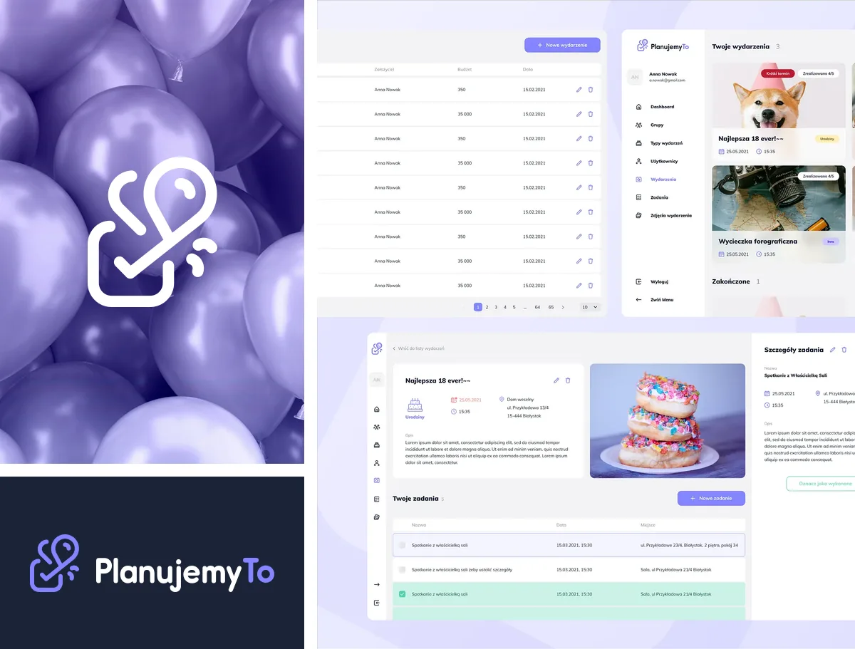
Free event-planning app — brand, product and design system.
0→1 Design
Brand Identity
Design System
Naturalnie.pl

Naturalnie.pl

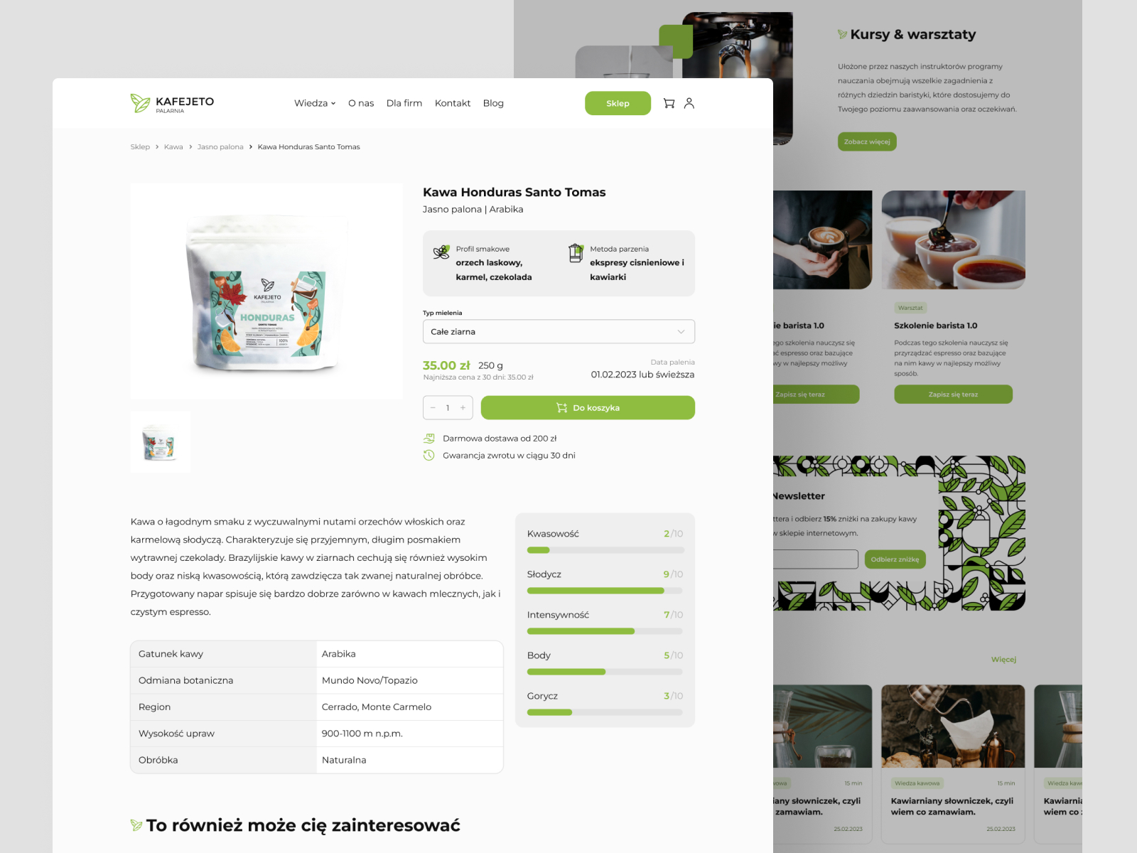
Mobile UI concept for a natural cosmetics and personal care online store.
Redesign
E-commerce
Mobile Design
Kafejeto.pl

Kafejeto.pl

Online store for a Polish specialty coffee roastery — fresh coffee, accessories, training.
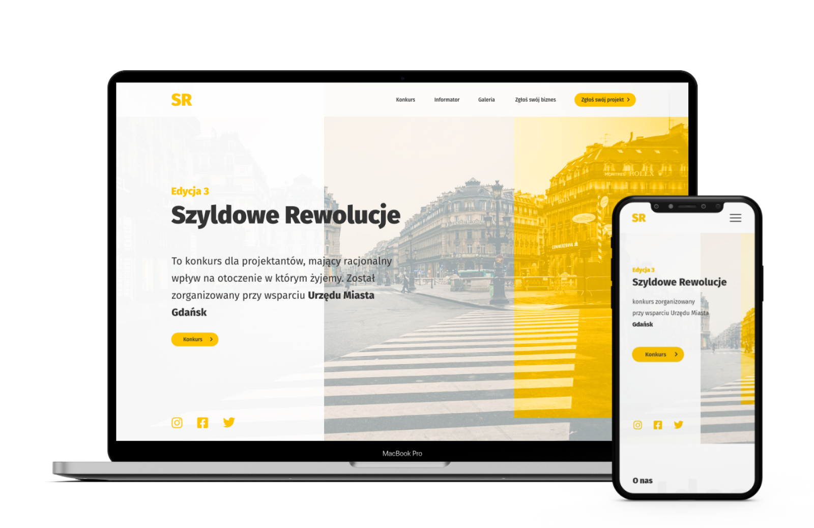
UI Design
E-commerce
Responsive Web
Banner Revolution

Banner Revolution

Competition website for designers fighting advertising chaos in urban space.

0→1 Design
Non-profit
UX Research

Let's talk

Want to talk about a project, learn more about the process, decisions, and context? Find me on LinkedIn or just send an email : )
BRAND & PRODUCT · PLANUJEMYTO

PlanujemyTo, together.

0→1 Design
Brand Identity
Design System

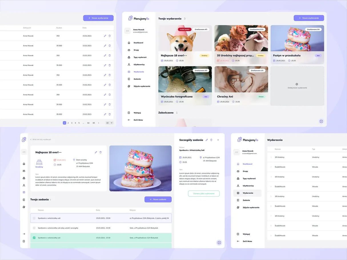
PlanujemyTo is a free event-planning app: weddings, christenings, birthdays, eighteenths, trips. Instead of an empty list, the user picks an event type and the app suggests the tasks that kind of event always needs ticking off, each one with a date, a place and a note. I owned the whole visual and product side of this project: the brand, information architecture, flow, the app and admin panel interface, and the design system both of those are built on.

Screenshot of the PlanujemyTo app.
The PlanujemyTo mark, a checkbox joined with a balloon.
The full horizontal PlanujemyTo logo.

01 · Brand

Identity and mark system

The brand had to carry many different event types at once, from christenings to eighteenths, so it couldn't lean into any single one of them. I built it around a checkbox standing for a completed task and balloons, which turn up at most of these events. Together, the two symbols describe everything the product does, and combined into one shape they read as the heart of PlanujemyTo.

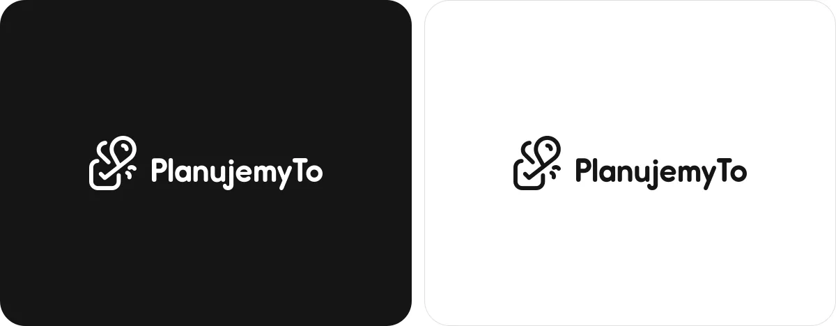
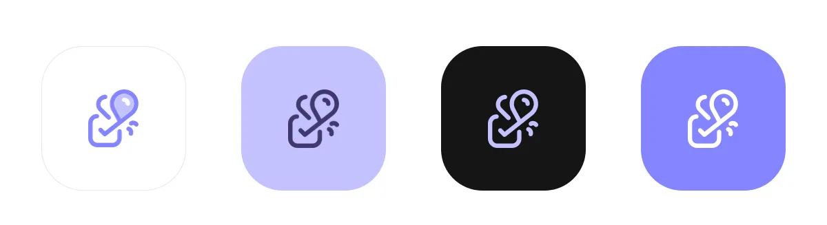
The mark got the full set of uses the product actually needs: a horizontal lockup, a standalone symbol, mono versions for light and dark backgrounds, and an app icon in four colourways. The symbol is simple enough that it holds up all the way down to favicon size.

Horizontal lockup of the PlanujemyTo logo, checkbox joined with a balloon.
Concept sketch showing how the checkbox and balloon combine into the PlanujemyTo mark.
Two panels side by side showing the mono variants of the PlanujemyTo mark on light and dark backgrounds.
Four colour variants of the PlanujemyTo app icon.

02 · Colour

Palette and colour hierarchy

The palette stands on one saturated violet and four supporting colours that stay a step behind it. Lavender carries backgrounds and highlights, a deep blue-violet holds the typography and the dark variants of the mark, and white and near black close off the contrast range.

I kept violet strictly for action: buttons, active states, the symbol. In a product where a dozen-plus tasks, statuses and lists all live on screen at once, one reserved action colour does the job of showing where you can actually click.

#8585FFViolet
#C2C2FFLavender
#40386DDeep Purple
#FFFFFFWhite
#151515Near Black

03 · Product

The app and the admin panel, one system

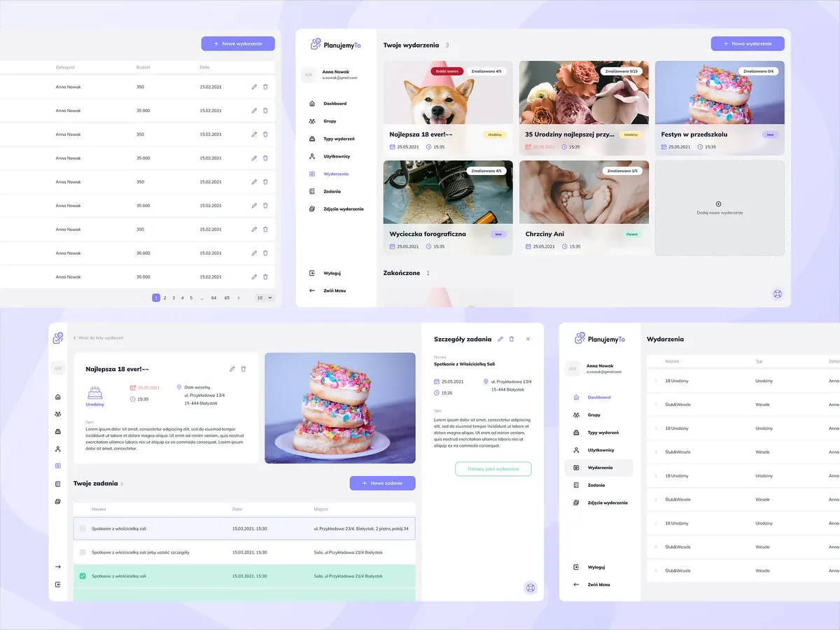
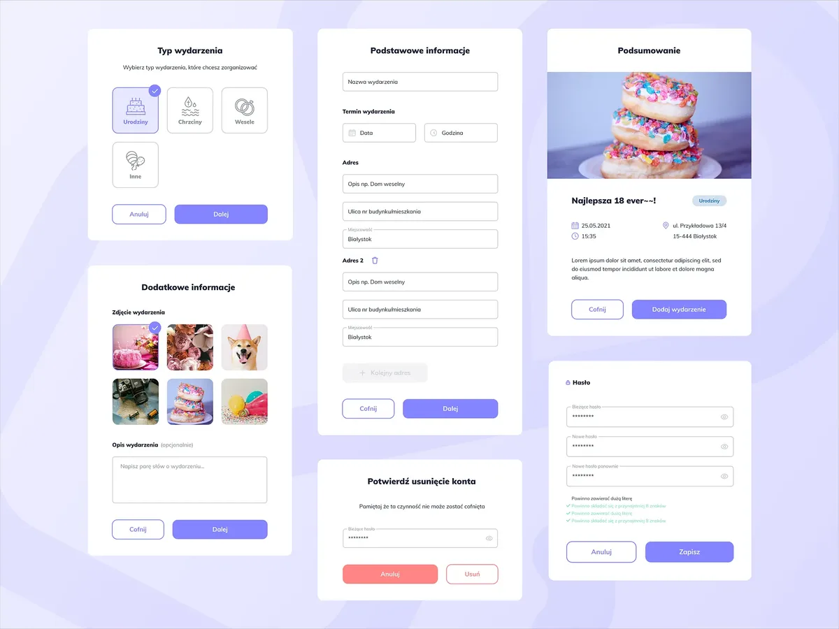
The app carries one event from start to finish. The user picks a type, gets a suggested task list, and is working with specifics right away: every task has a date, a time, a place and a note, and the event tile shows how many days are left. Checking a task off is the only action you need to understand to get started.

Alongside the user-facing layer, I designed the admin panel: event types, tasks, users and groups. It decides what the product suggests on day one, so it needed just as much attention as the app itself, even though no end user ever sees it.

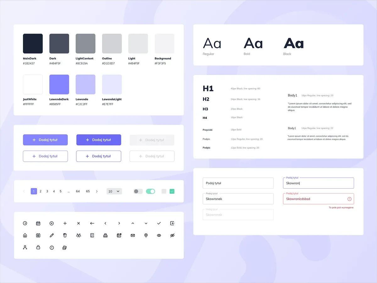
Both stand on a design system built for this product: typography, colours, forms, tables, tiles, empty-list states. It's what makes the app and the panel read as one product instead of two separate ones.

Screenshot of the event view in the PlanujemyTo app with its task list.
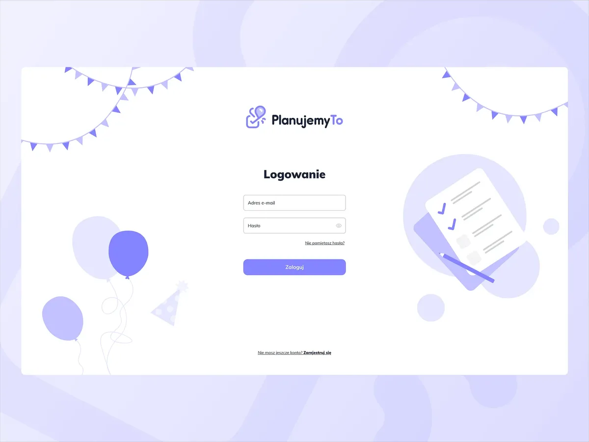
Screenshot of the PlanujemyTo app login screen.
Screenshot of the PlanujemyTo admin panel managing event types.
Screenshot of the PlanujemyTo design system components.
The PlanujemyTo wordmark in white on the violet brand field.
The PlanujemyTo mark on a solid brand-colour field.